Dive into the digital world, and you’ll quickly find that web design is not just about colors and fonts. At its core, it’s about arranging individual elements in a way that speaks to the audience. With CSS libraries’ evolution in 2023, two tools stand out as close competitors in web design: CSS Grid vs Flexbox.
Each has its strengths and together, they represent different layout methods that are integral to the background behind today’s dynamic layouts.
These designs can adapt to larger-scale layouts, easily adjusting for different screen sizes and devices. Yet, you might still find yourself tangled in the age-old question: “What’s the most efficient layout structure for a seamless user experience?”
Choosing the wrong layout mode can make your code inefficient, make your design less responsive, and leave you frustrated. Fortunately, this guide will break down the advantages and ideal usages for each.
By the end, you’ll be equipped to create web designs that are not only visually appealing but also responsive, user-friendly, and cross-browser compatible. So, let’s begin.
Table of contents
What Is Flexbox?
Flexbox, known as “Flexible Box Layout,” represents a one-dimensional layout system that developers use to organize content on websites. Specifically, it helps in arranging buttons, images, texts, and other element sizes within a flex container to make them look neat and balanced.
Flexbox adjusts to fit the content, even if the text or images change in size. Instead of manually arranging each item, developers use flex layout features to organize elements on different screens neatly, making modern websites look and work better.
Its key benefits and features include:
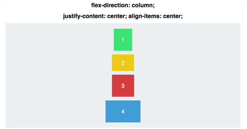
- Centering made simple: With Flex property, you can easily put a picture or a text in the page’s center using positioning properties like the “align-items: center;” command—no need for tricky methods.
- Switching order: On devices like phones or tablets, you might want items to show up in a different order. With Flexbox, you can quickly rearrange them using the “order” command.
- Adjusting to different sizes: If you’ve had text or images that vary in size, Flexbox makes sure they always fit perfectly. Using commands like “flex-grow, flex-shrink, and flex-basis”, you can make sure everything stays looking neat.
- Pick your flow: Flexbox gives you different toolkits to create varied layouts and designs that adapt to different screen sizes and content types. You can have columns and rows or even reverse the order easily.
Start with Flexbox by turning an area on your webpage into a “flex area” by simply adding display: flex; or display: inline-flex;. After that, you use specific Flexbox commands to decide how everything inside that area should look and behave.
Flexbox simplifies the most tricky web design parts–making things look neat on your website, no matter the device or screen size, becomes way easier. It’s a must-have tool if you want a modern, sleek website.
What Is A CSS Grid?

CSS Grid is a tool that web developers use to design different web page structures. It employs a two-dimensional layout system, likened to drawing a grid on paper and then distributing your content – photos, text, and videos – within the defined cells. This grid layout manages rows and columns simultaneously.
The key benefits and features include:
- Full control over rows & columns: Much like working independently, where you have autonomy over your tasks, with CSS Grid, you can define how many rows and columns you want and what size they should be. This gives you the precision to create a layout exactly how you envision it.
- Place items anywhere: You’re not restricted to just placing things from top to bottom. Want a photo in the top-right corner and text in the bottom-left? CSS Grid allows you to place items wherever you like on the grid.
- Responsive designs: It’s designed with all devices in mind. So, whether someone is viewing your website on a big desktop monitor or a small phone screen, CSS Grid helps ensure everything adjusts smoothly to look great.
- Less need for hacks: Before CSS Grid, developers often had to use workarounds to get the design just right. But now, old challenges are fixed in a breeze with Grid’s capabilities.
Starting with CSS Grid involves turning a specific area on your webpage into a “grid container” using the command display: grid;. After that, you set the rows and columns as you like and decide how each content piece fits into the spaces.
CSS Grid is like the ultimate Tetris game for web design. It makes designing intricate web page layouts simpler and more intuitive, proving to be a game-changer in how modern websites come to life.
Now the question is, which one will you use? Let’s dive into the differences to help you decide.
CSS GRID Vs. Flexbox: Which One Should You Choose?

At a glance, both CSS GRID and Flexbox help with layout design, but they serve different purposes and have distinct advantages. They’re key tools in crafting responsive layouts and organized layouts. Let’s delve into how these tools differ and guide you in making an informed choice.
1. Dimensionality
1.1 CSS Grid (2-dimensional)
CSS grid, often considered a two-dimensional grid-based layout system, operates in 2 dimensions: rows and columns. It lets you design websites with a structured approach, plotting grid items in any cell you choose.
uses:
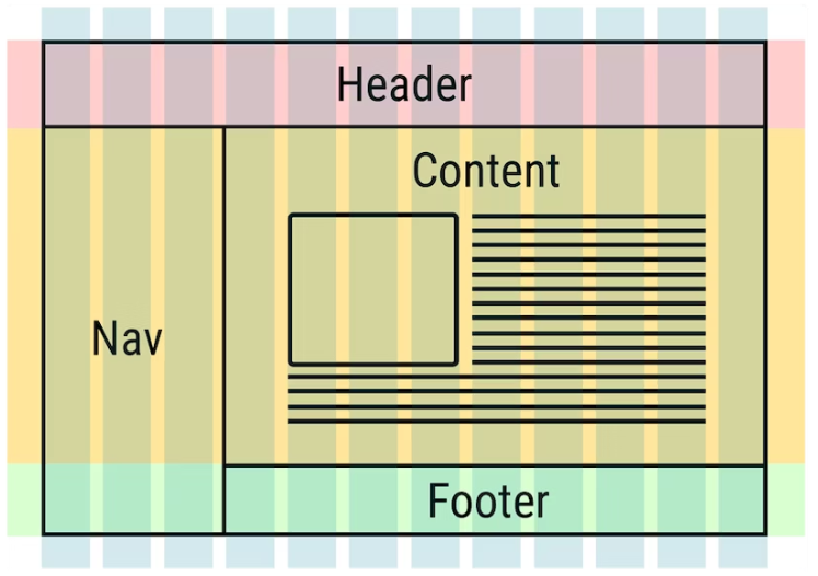
- Multi-Section layouts: With CSS Grid, a web page can be split into distinct rows and columns simultaneously, creating an outer layout. This is invaluable when designing web pages that require distinct areas, such as side panels, main content, and footers.
- Precise positioning: Using positioning properties and tools like grid-template-columns property, if you want an element (often referred to as a child element or grid item) to span multiple rows or columns, CSS Grid allows for that. With it, you can place an item exactly where it needs to be.
- Complex layout designs: Interactive infographics or complex visual web pages where elements overlap or interplay between rows and columns, CSS Grid – a two-dimensional model, makes these designs feasible.
Examples:
- Online newspapers: The front page could be styled in a table layout or a grid, where a headline might span multiple columns, a photo could extend several rows, and side news snippets sit in a single column.
- Dashboard interfaces: For apps that need to display widgets, charts, and lists on a single page like a yard management system, where each widget can occupy its grid space.
- Collage style portfolios: Artists or designers might want their work to be displayed in a mixed-size grid, with some artworks taking more space than others.
This blog reviewing the best medical alert watches is an excellent example that shows this:

The main content shows products in a clear, two-dimensional layout. This balanced product representation gives each an image logo on the left and its details on the right. This setup repeats down the page, forming review rows. It demonstrates how the grid-template-rows property and gap property can influence space among items.
This structure, mixing both side-by-side and stacked sections, highlights CSS Grid’s strengths. Using Grid, a developer can easily set spaces for both the image and details, making sure the layout stays consistent no matter how much content there is.
If you’re an developer working on HTML CSS based project then we recommend using Bootstrap Dashboard Templates to build responsive web apps.
1.2 Flexbox (1-dimensional)
Flexbox is streamlined for one-dimensional designs. Flexbox handles layouts linearly, whether you’re looking at a horizontal row or a vertical column.
Uses:
- Linear arrangements: Perfect for when you need a flexbox layout where elements follow a single line, either horizontally or vertically.
- Dynamic sizing: Since Flexbox adjusts based on the content, it’s ideal for scenarios where your content size can change, ensuring no wasted space.
- Sequential structures: Any design like a small-scale layout that follows a pattern, like a process list or navigation bar.
Examples:
- Website menus: The horizontal navigation bar at the site’s top or the vertical menu seen in mobile versions. Each menu item here is a flex item.
- Comment sections: On blogs or forums where user comments stack vertically, one after the other.
- Profile listings: A social media feed or a team members list on a company website, where each profile or post is shown one after the other.

On the same website, the top navigation bar is a prime example. With options like “, ” Best Medical Alert Brands” and “Medical Alert Systems” lined up horizontally, Flexbox would be a perfect tool to space and align these items evenly across the top.
2. Content vs. Layout
2.1 CSS Grid
CSS Grid focuses on structure first. You arrange your website’s entire framework, deciding where each section goes. It’s about structuring the website’s multi-dimensional layout framework, where each parent element and child element has a predefined space.
Uses:
- Complex layouts: For websites requiring intricate designs, like online magazines or digital newspapers, where you need block elements to create sidebars, main content areas, and other sections.
- Responsive design: When you want your website to adjust seamlessly across devices – from desktops to tablets to phones. With Grid, you can redefine your structure for each device size.
- Web applications: Sites that operate more like applications (such as dashboard interfaces) can benefit from Grid. It can easily handle panels, sidebars, headers, and content areas.
Examples:
- Online magazines: Consider a site where there’s a featured article taking up the left half, a sidebar on the right for trending articles, and a photo gallery below. CSS Grid can handle this complex design by setting up areas in advance.
- Portfolio sites: For photographers or designers showcasing their work. They might have image grids and want a consistent look without changing image size.
- eCommerce sites: An online store where products are displayed in a clean grid format. There’s a clear structure: a main area for products, a side section for filters, and perhaps a banner space at the top for promotions.
A great example is the Shop Solar Kits website. Their complete solar kits collections are showcased in a neat grid, with each item having a consistent look. There’s a specific space for solar kit images, price tags, and short descriptions. This systematic layout ensures users can quickly scan and select products, making their shopping experience smooth and efficient.

#2.2 Flexbox
Flexbox, on the other hand, is like arranging furniture in a room based on what you have. It’s adaptive. In the digital world, it’s all about fitting content neatly, no matter how much content there is. Flexbox ensures your site adjusts and still looks great if a new article gets added or an image is removed from a gallery.
Uses:
- Linear layouts: Perfect for toolbars and navigation bars, especially when you’re focusing on space distribution for complex metric data. For instance, when crafting a user interface dashboard that illustrates data streams, especially if looking for solutions similar to or as an alternative to Airbyte, Flexbox can help ensure that various data source icons or indicators maintain an evenly distributed appearance in a toolbar setting.
- Dynamic content: With content that changes – like comment lists or user posts – Flexbox adjusts and reflows items seamlessly.
- Centering: Historically, vertically centering an item was a task in itself. With Flexbox, centering both horizontally and vertically is a breeze.
Examples
- Navigation bars: Many modern websites use Flexbox for their main navigation. Why? Because items can easily be adjusted and wrapped as needed, ensuring a consistent look.
- Photo galleries: Let’s say you have a photo series, but they aren’t all the same size. Flexbox can ensure they line up neatly, no matter the individual dimensions.
- User profiles: Consider a social media site where each user’s post, with their photo and a comment, is displayed. Flexbox makes sure these elements align tidily next to each other.
3. Placement Control
3.1 CSS Grid
Offers a lot more precise placement. You can place any item exactly where you want it in the grid, making overlaps easy, too. This detailed control is a boon if you want to realize a specific vision down to the last pixel.

Uses
- Layered designs: If a design calls for images, text, or other elements to overlap in a controlled manner, CSS Grid can handle it effortlessly.
- Masonry layouts: Consider Pinterest, where different content block sizes fit together like tiles without any gaps. CSS Grid’s placement capabilities make this possible.
- Asymmetric layouts: If there’s a need for non-uniform designs where items don’t align in a straightforward row or column, you can use CSS Grid.
Examples
- Photo galleries: A gallery where some images overlap slightly, creating a layered look.
- Magazine layouts: Online magazines may want to replicate their print-look counterparts, with text flowing around images or pull quotes positioned away from the main text.
- Infographics: Visual data representations where certain data points or icons need to sit precisely over a background image or chart.
3.2 Flexbox
This is more about spreading out items in a straight line. If you want to put something in a specific spot, you might need to do a little extra work. But, it’s great at making sure there’s no space in that straight line.
Uses:
- Even distribution: Whenever there’s a need to have items spaced evenly, either in a row or column, Flexbox delivers.
- Responsive design: Especially in small-scale layouts, when content size might vary (like user-generated content or varied ad sizes), Flexbox can adjust the spacing accordingly.
- Aligning & justifying content: Whether centering items, pushing them to the space-between, or space-around, Flexbox has it covered.
Examples:
- Navigation bars: Menus where each item should take up equal space amounts or where items should be centered no matter their width.
- Card layouts: Consider blog post previews where each card or box should take up the same width and height with whatever content is inside.
- Footer links: A website footer where icons or links need to be evenly spaced, filling the width or container height.
4. Browser Support
4.1 CSS GRID
With web technologies evolving, browser support is always a key consideration. CSS Grid, being a relatively newer layout system, is warmly embraced by modern browsers.
Chrome, Firefox, Safari, and even the recent Edge versions all have a solid grip on Grid. However, the Achilles’ heel for CSS Grid remains the older browsers, especially the notorious Internet Explorer. Employing Grid might require some extra effort for websites where the audience still leans towards these older browsers.
Uses:
- Modern web projects: Ideal for projects targeting a younger, tech-savvy demographic known to use updated browsers.
- Web applications: Platforms aiming to deliver rich, grid-based user interfaces and don’t need to be excessively concerned about very outdated browsers.
Examples:
- Tech blogs or forums: Where users are more likely to be on the latest browsers.
- Interactive websites: Like portfolio designer and artist sites expecting a modern audience. A great example is travel platforms that guide users in finding the best airline prices with interactive graphics and filters that exemplify how a modern layout can enhance user navigation and experience.
4.2 Flexbox
Flexbox, older than CSS Grid, has wider browser support. Modern browsers love it, and many older versions support it too. This makes Flexbox a safer choice for projects targeting a varied audience with different browsers.
Uses
- General websites: Flexbox is versatile enough for sites that aim to reach the broadest audience, including those on older browsers.
- Mobile-responsive designs: Given Flexbox’s wide mobile browser support, it’s ideal for projects that prioritize mobile users.
Examples
- eCommerce platforms: Sites where losing even a small user percentage because of browser incompatibilities can mean a significant loss in sales. Especially when considering specialized providers such as an offshore hosting company, which might serve diverse user sets across various geographies and browser preferences.
- News websites: Catering to a broad demographic, from young to old, all accessing content via varied browsers.
- Educational platforms: The browser ranges can be diverse, especially if targeting various students and older academics.
Key Differences Between Flexbox & CSS Grid
| Feature | Flexbox | CSS Grid |
| Purpose | Mainly for one-dimensional layouts | Designed for two-dimensional layouts |
| Orientation | Horizontal or Vertical | Both Horizontal and Vertical |
| Content-Driven | Yes (flex items) | Not primarily (defined by explicit rows and columns) |
| Placement Control | Limited | Explicit placement with row and column lines |
| Auto Rows & Columns | Not applicable | Can auto-create rows/columns |
| Browser Support | Browser support (with some vendor prefixes) | Newer, but supported in modern browsers (some old versions require prefixes) |
Remember that neither Flexbox nor Grid is “better” than the other in every situation. They each have their strengths and can even be used together in certain designs. The choice should be based on your project’s specific layout needs.
You also need to build a strong web designer team. The right tools matter, but they’re only as good as the people using them. A skilled team not only uses these tools effectively but also advises on the best design approach for your project. They draw from their experiences to tackle challenges, propose innovative solutions, and ensure your design appeals to your target audience.
Conclusion
Both tools have proven invaluable in the 2023 CSS landscape. Both have unique strengths in the CSS world 2023. When deciding which to use, think about your layout needs.
If you’re going for complex, two-dimensional designs with rows and columns, Grid is your go-to. But if it’s about spreading items in a straight line and ensuring no gaps, Flexbox has got your back.
Now, if you’re looking for a jumpstart on your next project, check out ThemeSelection. We’ve got Fully Coded Dashboard Templates & UI Kits that can seriously kick things into high gear. Dive in and make your next design project a breeze.