
Since graphic design is the pillar of a brand’s identity, your business should stay updated on changes in the way people convey and understand messages visually. By knowing these graphic design trends, you will improve how you create your business collaterals, including your logos, brochures, business cards, and website pages.
The result? You can come up with relevant and captivating designs that will yield the best marketing results for you.
With that in mind, here is a roundup of current graphic design trends you should be aware of:
1. Mix of 2D and 3D
Combining 2D and 3D elements has been one of the biggest trends for some time now. In animation, for instance, there’s such a thing as hybrid animation. You know when you sometimes find a 2D character with a 3D view or a 3D character set against a 2D background in TV shows? That’s hybrid animation.
But let’s back up a bit. What exactly do we mean by 2D and 3D in the first place?
2D, or two-dimensional elements, are created on a flat plane with only two dimensions: height and width. It is the traditional form of graphic design used in illustrations, photographs, paintings, and even print media. 3D, or three-dimensional elements, on the other hand, introduce the element of depth to a design, creating a sense of space and realism.
Therefore, the authenticity of the 2D elements combined with the realism of 3D visuals gives more life to the design. In addition, the incorporation of animation, photos, and flat designs into 3D illustrations results in beautiful creations. The final output can look incredibly lifelike or abstract. As a result, the combination of 2D and 3D elements is ideal for a wide variety of creative assets, including social media posts.
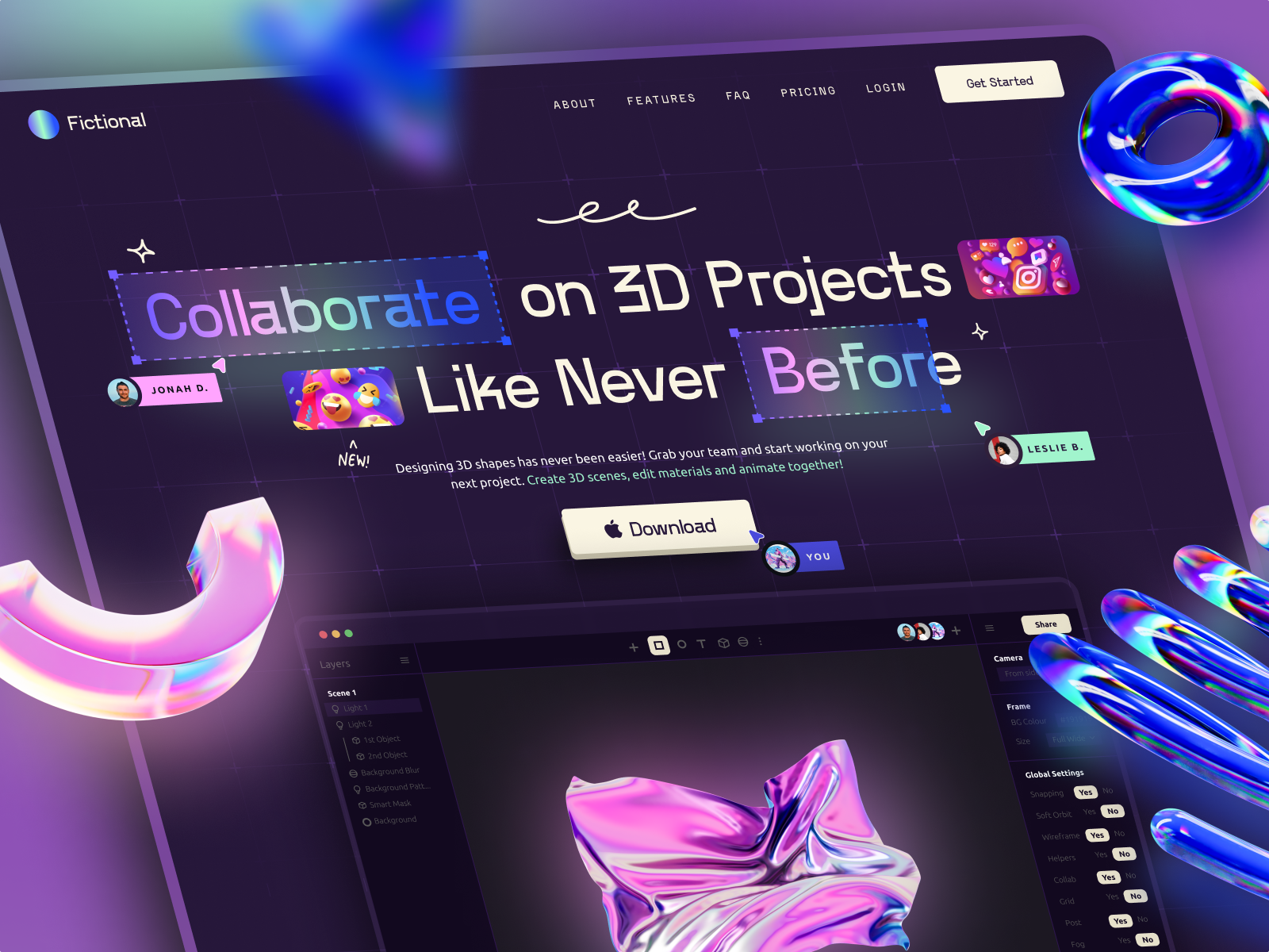
You can even use a mixture of 2D and 3D elements in web design. Here’s a great example of a page that uses a combination of these elements.
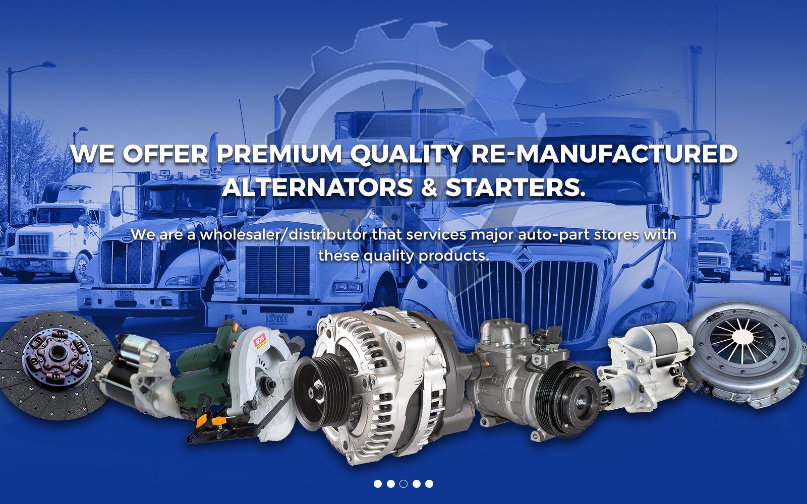
Notice how the 3D and 2D components above combine to create an eye-catching industrial web design aesthetic. The 2D copy makes it easier for viewers to understand the company’s message. It’s straightforward and doesn’t look visually complicated. The 3D metallic pieces in the foreground, meanwhile, add more life to the page. This is especially important for website visitors who might think of metallic alternators and starters as complex and boring concepts.
2. Nostalgia
While new trends usually signify new practices and solutions, it could sometimes also mean going back to the good old days. That said, there has been a throwback to the design styles of the ’70s, ’80s, and ’90s even amidst the introduction of modern graphic design techniques. This trend made its reappearance during the pandemic when some communicators thought reminding people of the relatively simpler times was the best way to give them solace and comfort.
The truth is, they did bring the comfort and solace people were looking for. The designs, known for their vintage styles, expressive fonts, bright colors, and geometric shapes, may be old, but they do evoke refreshing familiarity. Besides, they add new dimensions to creativity.
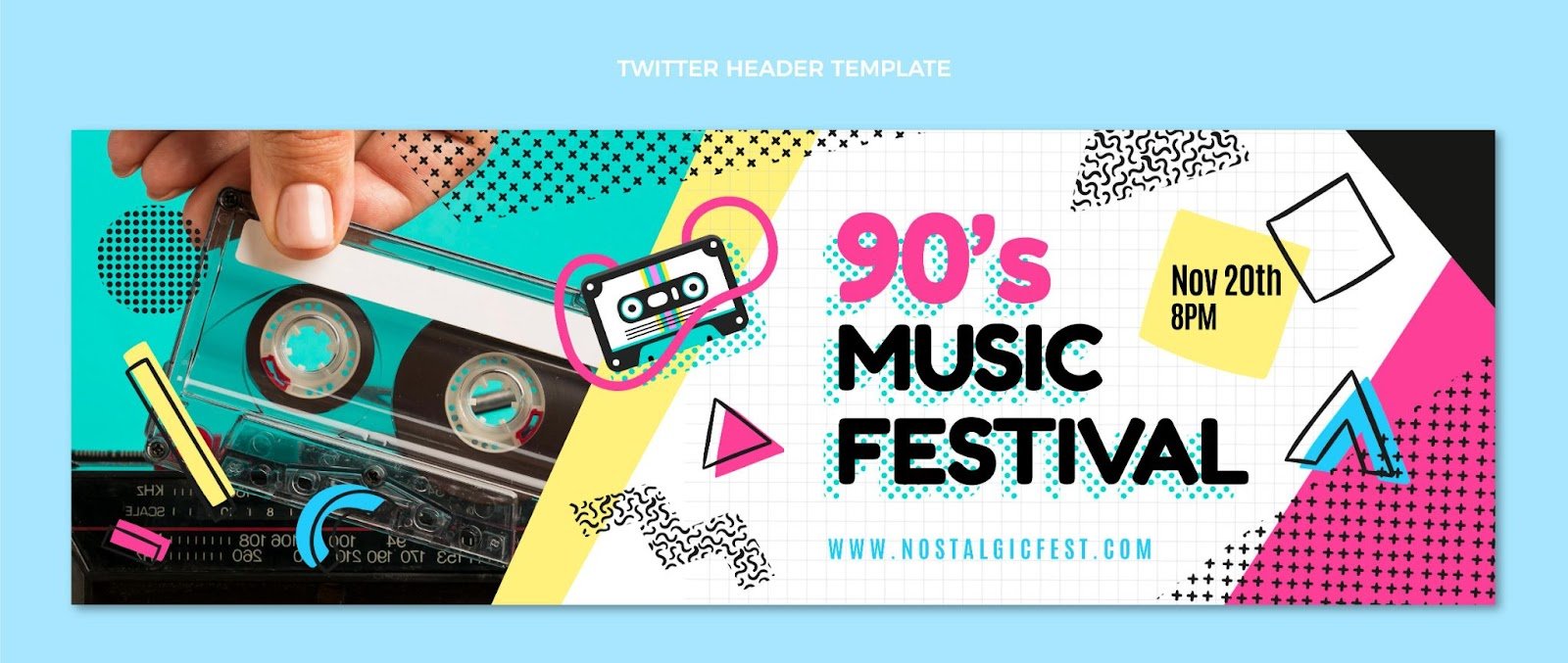
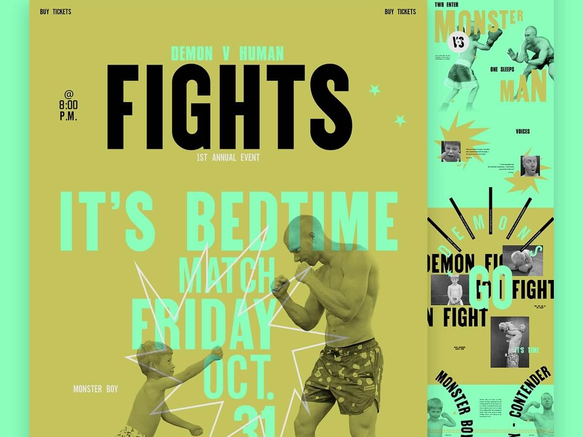
Why not see this for yourself? The featured image above shows a digital design depicting the nostalgic trend. See the characteristic bold and vibrant colors, abstract shapes, and static visuals that, combined, make the overall design stand out.
Since nostalgia designs scream positivity and good energy, adopting them in your designs helps you establish a sense of authenticity and trustworthiness with audiences of that generation.
3. Experimental Typography
What is design without the freedom to explore and experiment? This next graphic design trend lets you have just that. Unlike conventional typography with uniform font sizes and regularly arranged text, this trend involves playing around with lettering.
Experimental typography involves the use of different typefaces to create a more robust and edgy design. It allows for more creativity, helping brands to, not just produce attention-grabbing designs, but also to express their unique voice. It’s, therefore, a great trend to follow if you’re looking to stand out and gain your audience’s attention.
Since experimental typography is, well, experimental, you can use everything from custom-made fonts to hand-drawn lettering. You can even combine these to create other playful compositions.
This San Diego Design Week website landing page showcases an example of perfectly executed experimental typography.
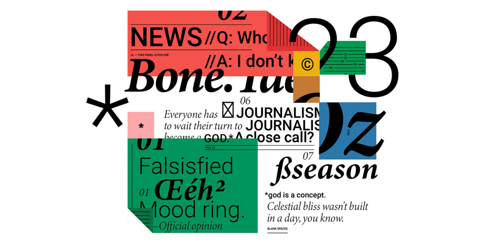
As shown above, the headline contains different lettering, with both mixed bright colors and heavy font. It also fits perfectly with the black background, which, in turn, gives the playful and bold-colored typography an edge.
While you can mix and match fonts as much as you want, you still need to make your overall output easy to read. Remember that, ultimately, the purpose of your design is to convey a message about your brand and connect with your audience. You can’t do that if your audience can’t even understand what you’re saying.
Just to illustrate my point, see the example below:
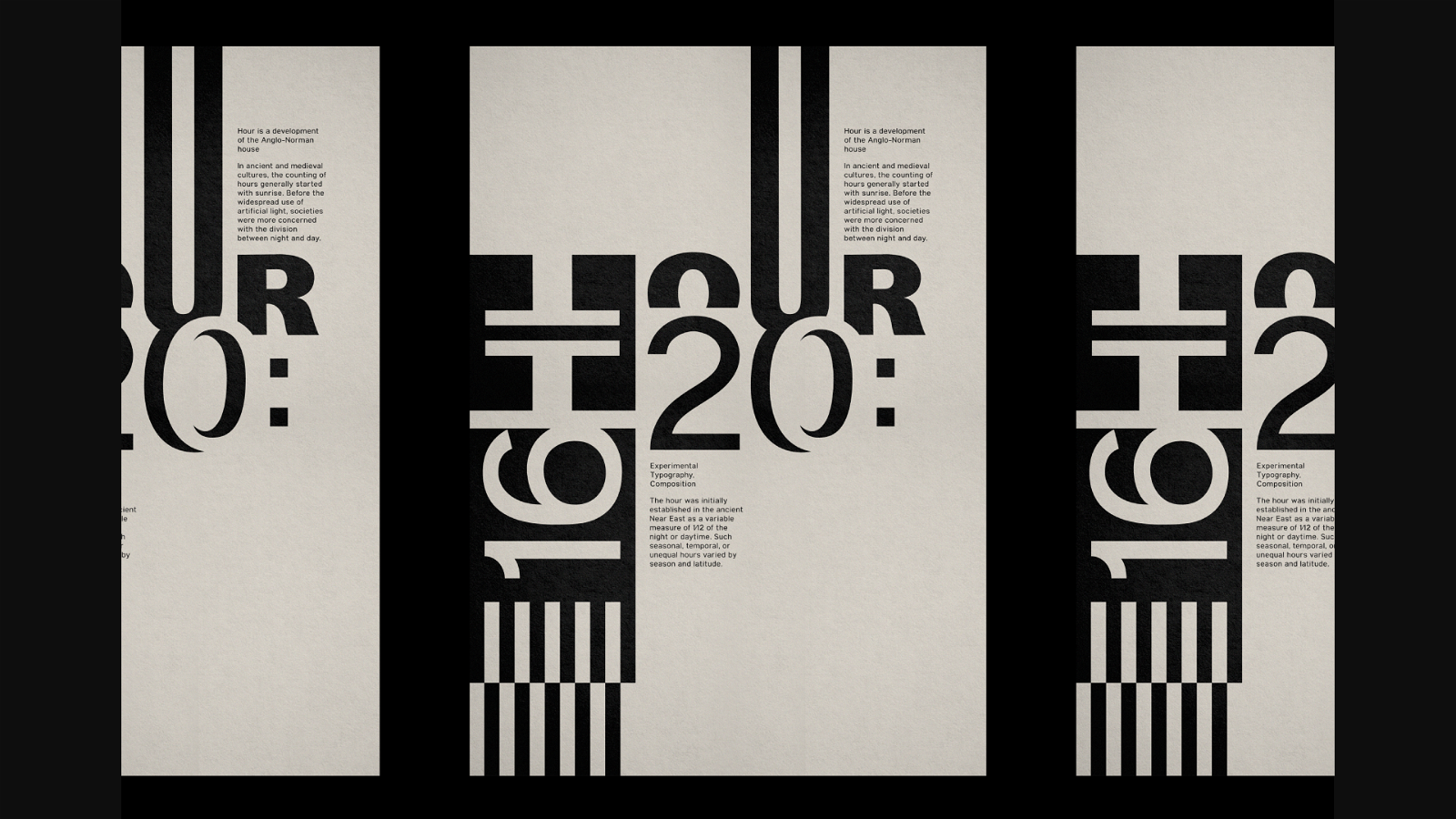
While you could argue that the word on the left side is clear (it says “body”), the word on the right side is not. Different people might even see different words. That single word can be read as “Eyes,” “Type,” or “Typo.”
4. Holographic Designs
Holographic designs can help make your creative assets more futuristic in nature and dynamic. These types of designs rely a lot on light. This light element adds a shimmering effect, giving an illusion of movement even on static images. Holographic designs also yield three-dimensional effects, making them more realistic and visually captivating.
The holographic trend was prevalent in fashion since the 90s. People of that time might remember the holographic bags and shoes that made anyone who wore or carried them stand out in a crowd. Today, in the graphic design world, the trend is particularly popular among tech brands and those targeting younger, tech-savvy demographics.
You can use these designs on stationery, holiday cards, postage stamps, stickers, etc. You can even incorporate a holographic design into product packaging. See the example below:
By incorporating holographic elements, brands can project an image of innovation and cutting-edge technology. This makes holographic designs an excellent idea for businesses that want to showcase a willingness to embrace the future, whether these are eCommerce companies, manufacturing brands, or digital and SaaS marketing agencies.
5. Anti-Design
Anti-design is a graphics design trend that pushes the boundaries of visual communication. As the name suggests, it goes against the rules of design as we have come to know it.
In other words, anti-design is an artistic rebellion to perfection in graphic design. It favors complexity over simplicity, asymmetry over symmetry, and disruption over routine. It allows the designer to really explore their creativity, shunning any constraints. The result? A deliberately messy and chaotic appearance (in a good way), as shown below.
That’s not to say you’ll compromise your brand’s messaging. Though there’s a lot going on in the image above, you can still make out the poster’s message: that there’s an upcoming match.
Also, keep in mind that the chaos in the anti-design trend is not everyone’s cup of tea, especially when it comes to web hosting. If you’re considering implementing this trend into your web hosting strategy, it’s crucial to create a style guide that allows you to seamlessly integrate these elements into your hosting services. This will ensure that your web hosting solutions, even if they embrace the chaos, will still effectively convey your hosting capabilities.
Additionally, while anti-designs may be a great trend to follow for social posts and other promotional material, web designers should probably just avoid it. Anti-designs may easily compromise your site’s accessibility and navigation.
6. Interactive Data Visualization
Data visualization is the presentation of numbers using bold outlines, bold colors, illustrations, and other visual elements. All these design components combined create a visually appealing output, transforming what would otherwise be a boring explanation of a concept into a more engaging one. Because the final output is engaging, the complex concepts are also easily understandable.
See a great example of some data visualizations below
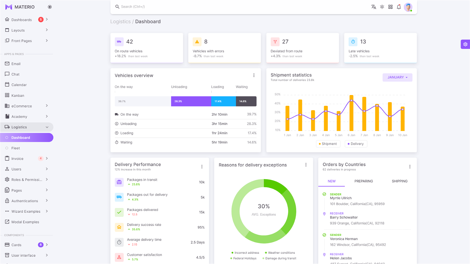
But you should go beyond static infographics, charts, and graphs. Follow in the footsteps of some graphic designers, who are now presenting complex data in a more interactive manner:
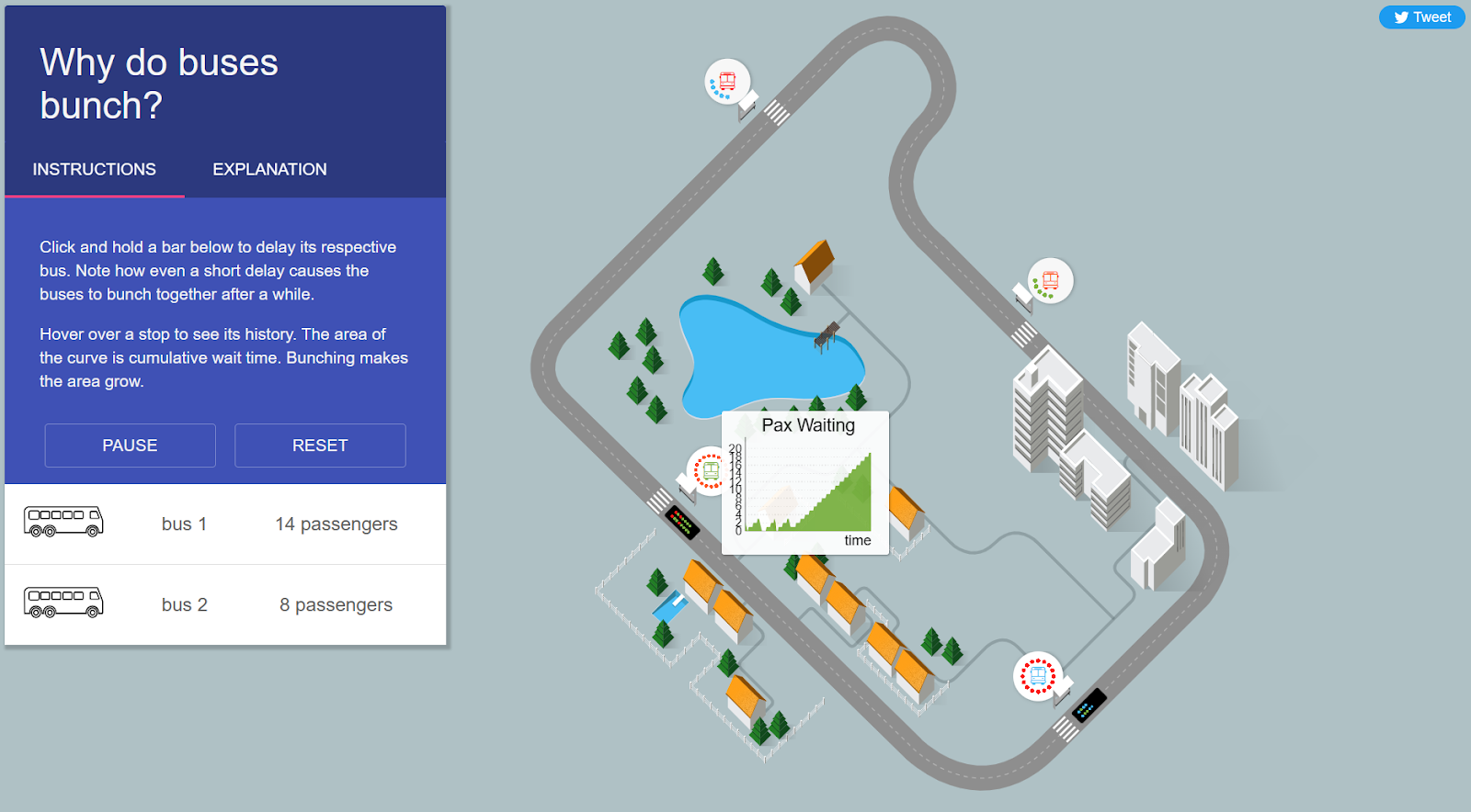
With interactive data visualization, you allow your viewer to further immerse themselves in your content. Rather than being passive recipients of information, they become active participants when you allow them to click on specific points in your graph to retrieve detailed data. You may even allow them to modify specific data to help them uncover insights tailored to their own experiences.
With interactive data visualization, brands, especially those dealing with data-heavy topics, such as tech and manufacturing, aren’t just empowered to explain even the most technical concepts and engage their audience. They can also easily visualize important information themselves, which they can use to tailor their user experience based on customer interests.
In Closing
Graphic design trends breathe new life into a wide variety of works. They don’t just help make these works eye-catching. They help improve their brand messaging as well. As a brand, you should incorporate these trends into your creative assets.
You learned some graphic design trends to follow in this article. These include 2D and 3D designs, nostalgic visuals, experimental typography, holographic designs, anti-designs, and interactive data visualization.
Experiment and see which ones and what combinations yield the best audience responses for you. Used the right way, these graphic design trends will help you connect better with your target audience. That can, ultimately, translate to business success. Good luck!